
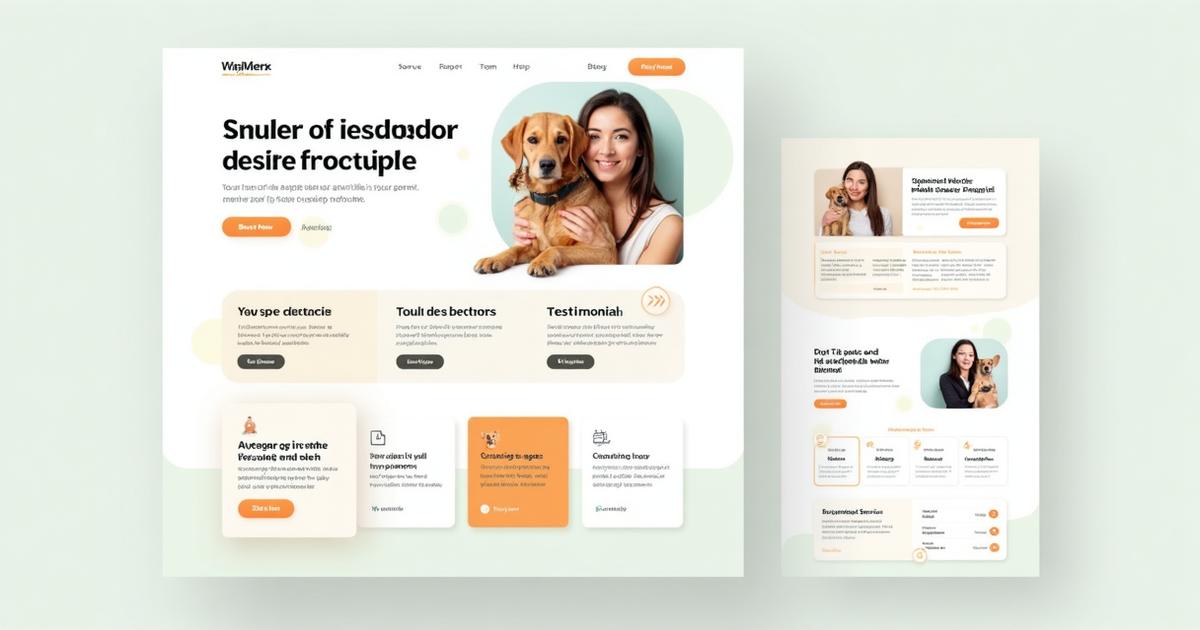
What a High-Converting Pet-Care Homepage Looks Like (F-Pattern Teardown)
Your homepage should answer three questions in five seconds: Who are you? Where do you serve? What should I do next? Use this F-pattern teardown to turn visits into bookings—without redesigning your whole site.
Building or revamping your pet-care business website?
Your homepage is your first impression – it's where anxious pet parents decide in seconds if you're trustworthy and the right fit.
To make those seconds count, smart web designers use the F-pattern strategy. In this casual teardown, we’ll explore what the F-pattern is, and how to place key elements (logo, headline, value prop, CTA, social proof, etc.) on your pet-care homepage for maximum impact.
We’ll even include a sketch to show you exactly how it can look. Let’s fetch those conversions!
Understanding the F-Pattern Scanning Behavior
People generally scan websites in an “F” shape. This comes from eye-tracking studies by the Nielsen Norman Group and others:
- Users read horizontally across the top of a page
- Then down the left side
- Then across again a bit lower down
Eyes start at the top-left, move right along the top line, then drift down the left side, occasionally scanning toward the right. It creates an F-shaped heatmap pattern.
Why does this matter?
Visitors don’t read everything — they scan. Placing must-see content where their eyes naturally go first helps them understand your value quickly.
The F-pattern works especially well for pet groomers, walkers, sitters, and boarding businesses because most of these sites follow familiar layouts. It sets a clear visual hierarchy that guides visitors effortlessly.
🐕 Professional Pet Photography Services
Need stunning photos for your website? Our pet photography specialists capture the perfect shots that convert visitors into clients. Book a photo session →
Placing Key Elements for Maximum Impact on Your Homepage
So, how do we apply the F-pattern to your homepage? Let’s break down the essentials.
🏷️ Logo & Branding (Top-Left)
Place your logo in the top-left — the very first place the eye lands. This reassures visitors that they’re in the right place and builds brand recall.
Pro tip: Keep your header uncluttered so the logo stands out. Add a tagline if your business name isn’t self-explanatory.
🧭 Navigation Menu
Your navigation sits close to the logo. Even though users often skim past navigation at first, it should be easy to locate when they need it.
Keep labels simple: Services, Pricing, About, Contact. A booking link or phone number in the top-right works well for ready-to-act visitors.
📢 Headline & Value Proposition (Top Section)
Your headline is the star of the show.
It should:
- Sit near the top-left
- Be bold and benefit-focused
- Tell visitors exactly what you offer
Example: “Happy Paws Grooming — Stress-Free Spa Days for Your Dog.”
Place your subheadline just below it for clarity. This top horizontal line is a critical part of the F-pattern.
🖼️ Hero Image (Top-Right)
Pair your headline with an eye-catching hero image on the right side. People are visual — especially pet parents.
Use a warm, welcoming image like:
- A freshly groomed dog
- Pups playing together
- You caring for a client's pet
Great visuals + a strong headline = instant emotional connection.
💼 Professional Website Design Services
Don’t have time to implement all of this? We build conversion-ready pet business websites using proven F-pattern principles. Get your website quote →
🎯 Primary Call-to-Action (CTA) Button
Once they've seen your headline and image, they need direction.
Your CTA should be:
- Visible
- Bold
- Placed along the left side
- Action-driven (e.g., “Book My Walk”)
This aligns perfectly with the vertical scan of the F-pattern.
Hint: Keep a CTA visible without scrolling — then repeat it further down the page.
✅ Key Benefits or Bullet Points
Below the hero section, add a short left-aligned bullet list of benefits.
Examples:
- ✔ Fully insured and first-aid certified
- ✔ 100+ happy pet clients
- ✔ Pickup & drop-off included
Bullets help scanning users understand your value in seconds.
⭐ Social Proof (Testimonials & Trust Signals)
Further down the page — where eyes naturally slow down — add trust-building elements:
- Testimonial quotes
- 5-star ratings
- Logos of pet-care associations
- Certifications
These elements often form the second horizontal stroke of the “F”.
📱 Social Media Marketing for Pet Businesses
Want to build trust and show off happy pets? Our social media management service helps you grow online. Boost my presence →
ℹ️ Important Secondary Info
Sections like:
- About Me
- Services
- “How It Works”
- Pricing teasers
- FAQ Callouts
should follow the same left-to-right rhythm. Use clear subheadings and optional supporting images on the right.
This keeps the F-pattern flow intact and easy to follow.
📞 Footer and Contact Info
At the end of the F-pattern’s vertical stem, users expect a simple footer:
- Phone
- Service areas
- Contact link
- Social links
Many pet businesses add a final CTA here: “Ready to get started? Let’s chat!”
Example Layout: F-Pattern in Action
HEADER:
[LOGO] --------------------- [NAV MENU]
↓ First horizontal scan

HERO:
[HEADLINE + SUBHEAD] ------- [HERO IMAGE]
↓ Eye moves down left side

CTA:
[BOOK NOW BUTTON]  ← Placed in scan path
↓ Continues down

BENEFITS:
[• BULLET POINTS] ---------- [TRUST BADGES]
↓ Second horizontal scan

SOCIAL PROOF:
["★★★★★ Great service!" – Client]
↓ Bottom of F-pattern
Red arrows in a real wireframe would show the eye path: Logo → Nav → Headline → Image → CTA → Benefits → Social Proof.
Visitors absorb the essentials during their natural scan pattern.
The Strategic Flow
Here’s the journey they experience:
- Who are you? – Logo
- What do you offer? – Headline + Image
- What should I do? – CTA
- Why trust you? – Testimonials / Badges
This is exactly why the F-pattern works so well for pet-care websites.
Convert More Visitors (Even If You're Short on Time)
A high-converting pet-care homepage blends smart layout + emotional appeal:
- Use friendly, conversational copy
- Highlight how you make pets and owners happy
- Showcase real pet photos
- Place CTAs where scanning eyes naturally go
If you're too busy running your business to redesign your site — that’s where we step in.
Tail Wagging Web Design creates beautiful, high-converting websites for pet professionals. We handle the strategy so you can focus on the pets.
Let’s turn your homepage into a client-converting machine.
Get Personalized Help
Ready to implement these strategies? Book a free consultation to discuss your specific needs, or explore our complete pet-care web design services for comprehensive solutions.
Frequently Asked Questions
What should be above the fold on a pet-care homepage?
A clear one-liner value prop, service area, primary CTA (Book/Quote), and trust badges (insurance, DBS, reviews).
How many services should I display on the homepage?
Three to six cards with short outcomes. Deep details live on service pages.
Do I need prices on the homepage?
Show from-prices and link to full pricing. Clarity reduces drop-offs and price-shock.