Price Pages That Don’t Confuse: 3 Tiers, 1 Anchor, Clear Add-Ons
A pricing page is a decision tool—not an invoice. Use three tiers, one obvious “Most Booked” plan, and 3–5 add-ons. Keep the copy outcome-focused and show the path to book.
Introduction
Ever been put off by a website's pricing page because it was just too confusing? Imagine being a busy pet parent trying to figure out a groomer's or dog walker's costs, only to face a messy list of options and hidden fees. Not a great feeling, right?
For pet care businesses, a clear, simple pricing page isn't just nice to have – it's crucial. Complicated pricing drives away potential clients. On the flip side, transparent pricing pages help visitors quickly understand your services and feel confident to book, boosting your conversion rates.
In this article, we'll show you how to create price pages that don't confuse (and actually convince!) by focusing on three key elements: offer 3 simple tiers, use 1 standout "anchor" option, and list add-ons clearly. We'll also touch on where to put those all-important "Book Now" call-to-action buttons. Let's fetch you more clients with less confusion!
Keep Choices Simple with Three Tiers (Good, Better, Best)
When it comes to pricing options, less is more. Offering too many choices can overwhelm your visitors and lead to analysis paralysis – they freeze up and decide to "think about it" (or leave your site altogether). That's why sticking to around three pricing packages tends to work best. In fact, many successful companies intentionally limit their plans; for example, Shopify only offers three plans to avoid overwhelming customers. With three well-defined tiers, you give your clients a straightforward Good-Better-Best selection without drowning them in details.
Think about the services you offer in your pet care business and how they could fit into three buckets. For a dog groomer, this might be Basic Groom, Full Groom, and Premium Spa Package. A dog walker might offer a 15-minute potty break, a 30-minute walk, and a 60-minute adventure walk. Each tier should cater to a different client need or budget. This way, there's something for everyone: a budget-friendly option, a comprehensive premium option, and a middle option that most will find "just right."
(And yes, there's a bit of psychology here – given three choices, a majority of people tend to gravitate toward the middle option.) The key is to clearly define what's included in each tier using plain language (no industry jargon). For instance, if your "Full Groom" package includes nail trimming and ear cleaning, say so explicitly. As one grooming industry guide puts it, "Clearly outline what each basic service package includes, and use straightforward language to make information accessible to all clients." Clarity in package descriptions builds trust and prevents misunderstandings.
Pro Tip: Each of your three tiers should be distinct and easy to understand at a glance. Avoid minor, confusing differences between packages. Instead, structure your tiers logically (e.g. Bronze/Silver/Gold or Basic/Plus/Premium) and maybe target different client personas or pet sizes. The goal is to make the decision simple – your customer should be able to say "I'm a Basic kind of person" or "I need the Premium treatment" without second-guessing. Keeping it to three options keeps your pricing page clean and digestible, so pet owners aren't scratching their heads. Remember, pricing pages must be clear and transparent to avoid confusing or misleading people – and three options is usually that sweet spot.
One "Anchor" Plan to Guide Decision-Making
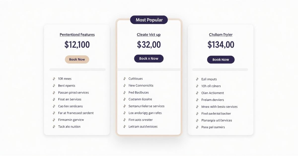
An example of a pricing table with three tiers. Notice how one plan is labeled "Most Popular," using visual emphasis to anchor the customer's attention on the recommended choice.
Basic Price: $50 Includes: Bath & Tidy CTA: Book Basic
Full Groom – Most Popular Price: $75 Includes: Complete grooming service CTA: Book Full Groom
Luxury Spa Price: $120 Includes: Premium spa experience CTA: Book Luxury
Here's a smart trick: use one of your tiers as an "anchor" to subtly guide customers toward the option you want them to pick. There are a couple of ways to do this, and both can help simplify the decision for your visitors.
First, consider using price anchoring psychology – that is, include a high-end, top-tier option (your "Best" package) as a reference point. This highest-priced tier serves as an anchor in the customer's mind, making the other tiers look more reasonable by comparison. Even if not many people choose that priciest package, its very presence can make your middle tier feel like a value deal.
The second (and very effective) method is to visually highlight one tier as "Recommended" or "Most Popular." Maybe it's your middle-tier plan (often the case), which offers the best balance of services for the price. By slapping a "Most Popular" badge or using a standout color/column for that plan, you draw the eye exactly where you want it. This anchored choice acts like a lighthouse on your pricing page – it signals to customers, "Hey, this is what most people choose and love." Highlighting a specific plan "draws attention to the offer that provides the most value...simplifying the decision-making process." In other words, it gently nudges folks toward the choice that benefits both them (good value) and you (higher revenue than the basic tier).
Why go to the trouble of anchoring? Because it works. People presented with three options often default to the middle one if they feel it's a popular, smart choice. Studies have shown about 66% of customers opt for the middle option when it's framed as the best value. So make it easy for them: use your design to say "this is the Goldilocks plan."
Finally, make sure this highlighted/anchor plan truly delivers value. It should be a great combo of services that you're proud to recommend. If people feel it's genuinely the best choice for their needs, they'll trust you – and a trusting customer is one step closer to hitting "Book Now."
Clearly List Add-Ons and Extras (No Surprises!)
Now let's talk about those add-ons and extra services. In pet care businesses, it's common to offer optional add-ons: nail trimming, teeth brushing, early drop-off, extra pets, extended playtime – you name it. Add-ons are fantastic for giving clients flexibility and boosting your revenue per client, but only if you present them clearly. The last thing you want is to hide additional fees or spring surprise costs on customers. In fact, the worst pricing pages are those that "bait" customers with a low price and then hit them with hidden fees – that just breeds frustration and mistrust. To avoid this, be upfront about what costs extra, and how much.
Additional Services & Add-Ons
- Nail Trim: +£10
- Teeth Brushing: +£15
- Flea Treatment: +£20
- Second Dog: +50%
- Large breeds: +£10
- Severely matted coat fee: +£15 (if needed)
Start by listing out any common extra services with their prices right on the pricing page (or at least on a dedicated pricing/details page). By doing this, you set proper expectations. A transparent pricing page that clearly communicates total costs removes conversion barriers and protects you from customer backlash (no one likes feeling nickel-and-dimed unexpectedly). It also helps clients appreciate the value they're getting, since they can see how extras stack up.
If some fees vary (say, grooming a large dog costs more than a small dog, or heavily matted fur incurs an extra charge), don't bury that info. Note it openly. Many pet pros use "starting at" pricing for this reason – to indicate the base price and that actual cost depends on specifics. For instance, "Full Groom Package starts at £50 (exact quote provided based on breed, size, coat condition)." Industry experts recommend this approach if you can't publish a single fixed price for all cases. The key is that the customer sees it coming. Being upfront builds trust.
Clear add-ons also let interested customers customize their purchase (and spend a bit more) without overwhelming those who just want the basics. You can keep your main tier prices attractive and then give people the option to "upgrade" with extras. This often increases your average order value without cluttering the core offering. So list those add-ons plainly, with concise descriptions if needed. Not only will this clarity prevent confusion, it might also entice upsells. Just be careful not to overload the page with a million tiny add-ons – list only the popular ones that matter. The goal is transparency and ease: your customer should feel in control of building the service package they want, and confident that they know exactly what it will cost.
Place Call-to-Action Buttons Where They Count
A pricing page isn't just for display – you want people to take action once they find the package that fits their needs. That's why well-placed Call-to-Action (CTA) buttons (like "Book Now", "Sign Up", or "Contact Us") are so important. Don't make visitors hunt for how to proceed! Each pricing tier should have its own CTA button, prominently shown with the package details. For example, under your "Gold Package" description and price, put a nice big "Book Gold Package" button. Under the "Silver Package", a "Book Silver" button, and so on. This way, as soon as a pet owner decides "Yes, I want the Silver plan," they know exactly where to click to start the process.
Make these CTA buttons stand out visually – use a contrasting color and make sure they're large enough to tap easily, especially on mobile. In practical terms, ensure each pricing section is in its own clearly defined box with a big button so users can "compare and tap on the option they want" without confusion. If your pricing page is long or has a lot of info, consider repeating a CTA at the top and bottom of the page as well.
Also, think about the context of your service: if actual online booking for each package isn't feasible (some pet sitters or trainers may need to discuss details first), your CTA can still be "Contact us to book [Package Name]" or "Schedule a Consultation." The key is that the next step is crystal clear and easy to do. On mobile, especially, avoid tiny text links or placing the CTA only in a hard-to-reach spot. Users often browse on their phones, so make sure your buttons are easy to tap – no pinching and zooming needed.
In short: don't hide the path to purchase. A clear pricing page with well-placed CTAs turns interest into action. Your visitors should never be confused about how to give you their business! Make it as straightforward as "See plan → Love plan → Click button → Done."
Confusion-Free Pricing Pages Fetch More Clients 💰
A clean, well-structured pricing page can be a total game-changer for your pet care business. When potential clients can quickly grasp your offerings, compare plans easily, and trust that there are no hidden gotchas, they're far more likely to hit that "Book Now" button. Clarity and transparency aren't just nice-to-haves – they directly impact whether a visitor becomes a paying customer.
By offering three simple tiers, using an anchor plan to frame the value, and clearly showing any add-ons or extra costs, you remove the biggest roadblocks that make people hesitate. In fact, transparent pricing pages that lay out clear tiers eliminate conversion barriers and prevent customer frustration. Instead of "Hmm, I'll call and ask later," your visitor says, "This makes sense – let's do it!" And that means more appointments, more bookings, and more wagging tails coming your way.
Ready to take the confusion out of your pricing and boost your bookings? 🐕
- Book a Free Consultation
- View Our Packages
Internal Resources & Further Reading
For more website tips tailored to pet care businesses, you might enjoy our other guides like Mobile-First Design for Pet Businesses (Thumb-Reach CTAs) and our Homepage F-Pattern Conversion Teardown. These articles dive deeper into creating pet websites that are paw-friendly and effective – check them out to keep improving your site!
© 2024 Tail Wagging Websites Design Factory Northampton. All rights reserved.
Get Personalized Help
Ready to implement these strategies? Book a free consultation to discuss your specific needs, or explore our complete pet-care web design services for comprehensive solutions.
Frequently Asked Questions
How many pricing tiers should I use?
Three tiers convert best: Starter, Pro (Most Booked), and Elite.
How many add-ons should I list?
Three to five. More creates decision fatigue and reduces conversions.
Should I show from prices?
Yes. From-prices reduce uncertainty and help qualified buyers self-select.